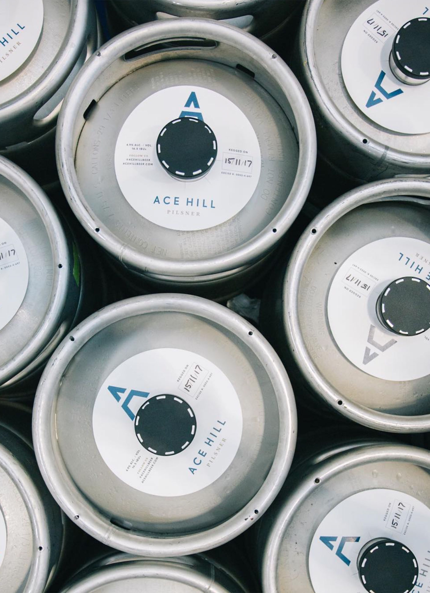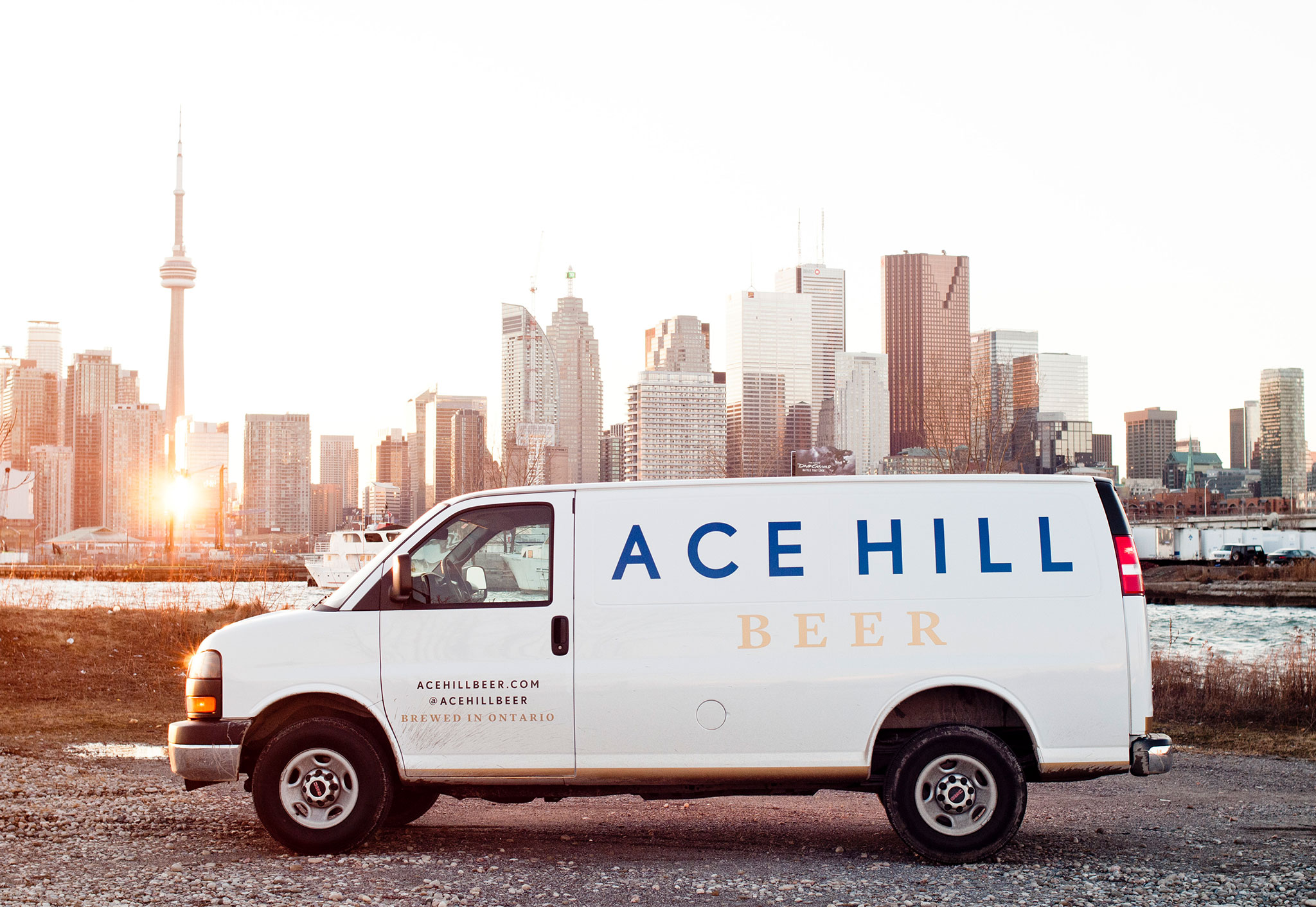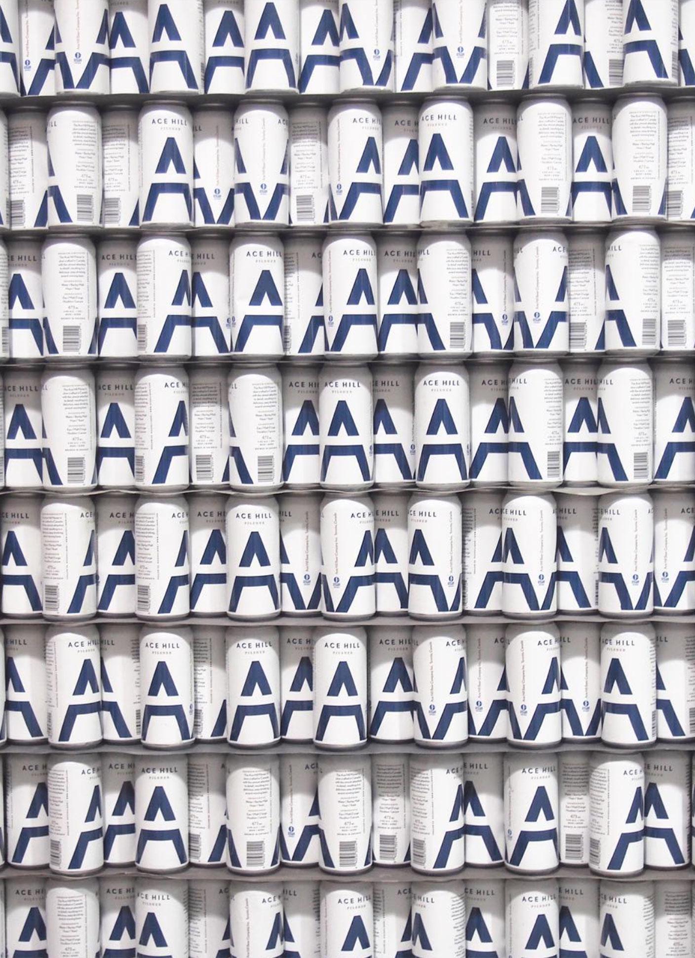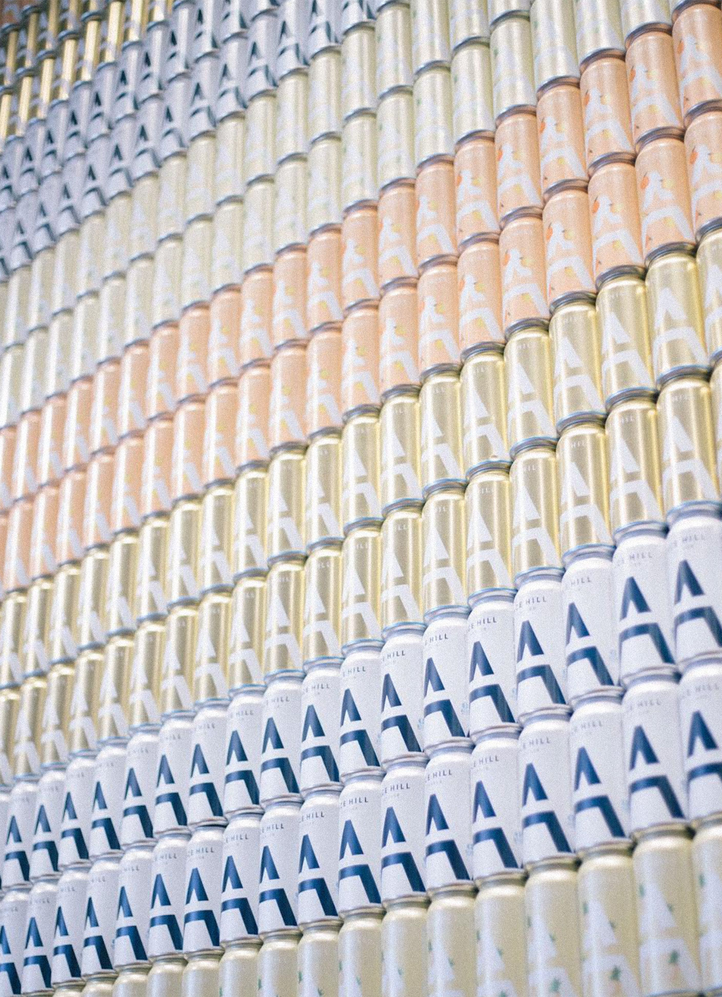
ACE HILL | HIGHLY CRUSHABLEAt the inception of Ace Hill the craft beer market was massively oversaturated. There was also such a pervasive look and feel. Every brand had that Americana, folky, “craft” aesthetic. This created such visual clutter with all these brands noisily competing for attention at the point of purchase. I wanted to create a can that felt iconic – both in-hand and on-shelf.
At the inception of Ace Hill the craft beer market was massively oversaturated. There was also such a pervasive look and feel. Every brand had that Americana, folky, “craft” aesthetic. This created such visual clutter with all these brands noisily competing for attention at the point of purchase. I wanted to create a can that felt iconic – both in-hand and on-shelf.
SCOPE
Creative Direction
Visual Identity
Custom Type
Packaging Design
Creative Direction
Visual Identity
Custom Type
Packaging Design
COLLABORATORS
Photography: Mark Olson
Photography: Mark Olson

VISUAL IDENTITY + ETHOS
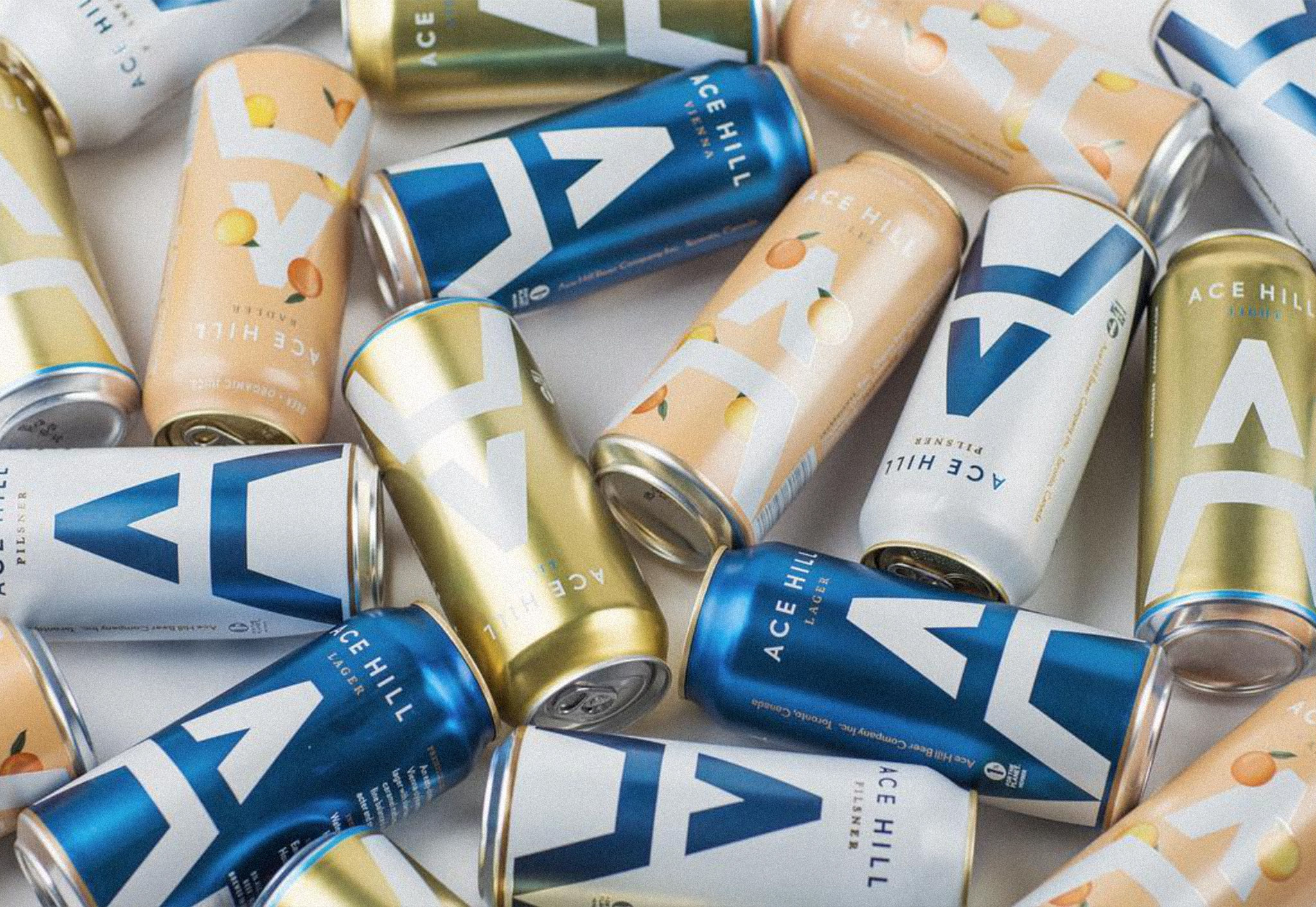
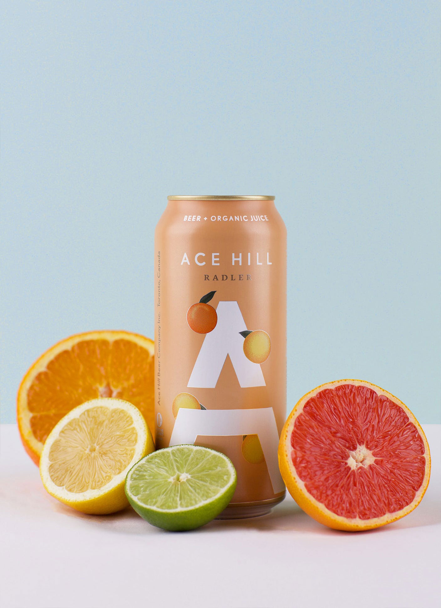
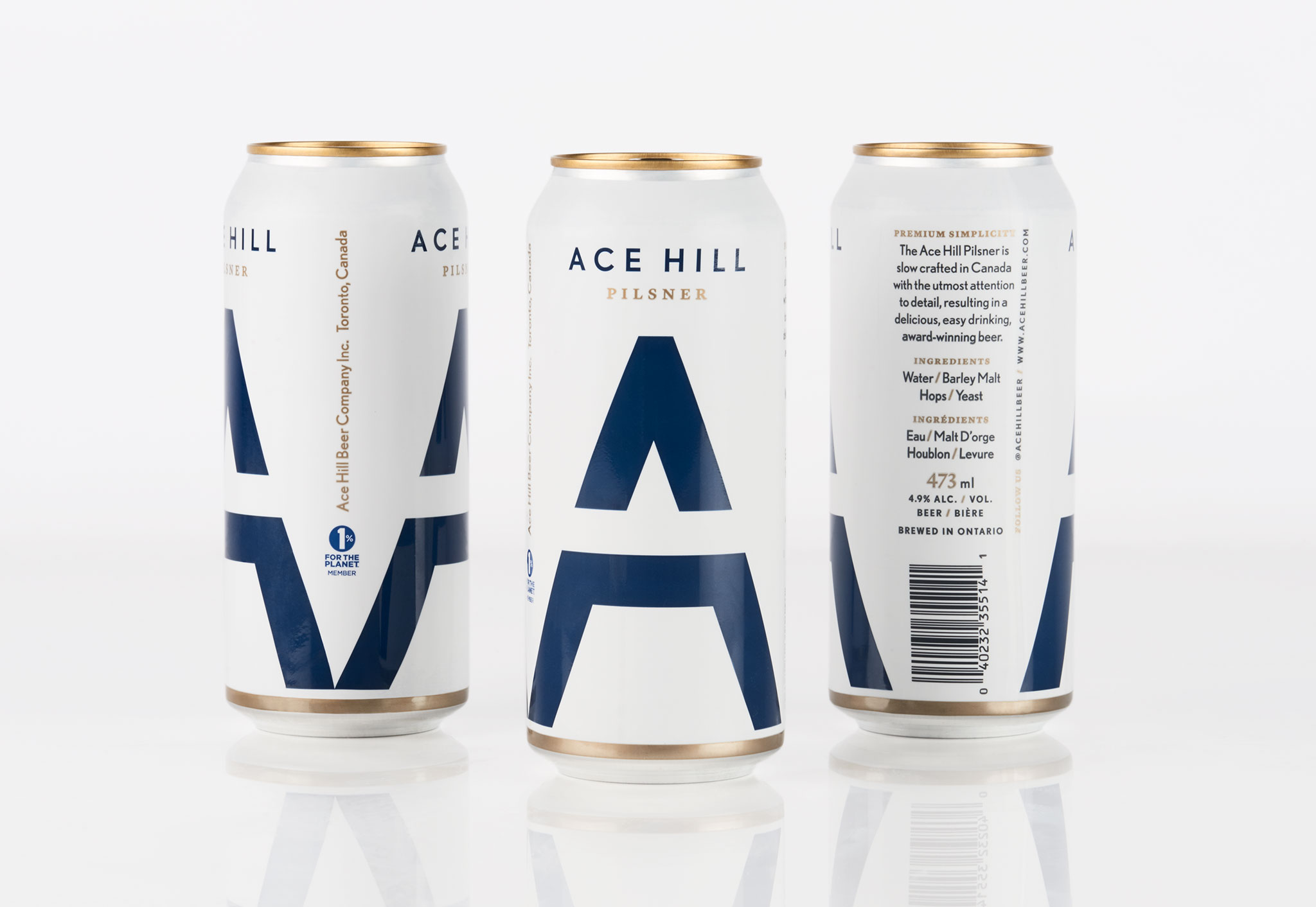
I treated the can composition as poster design. Creating a striking hierarchy of information which feels beautiful, elegant and bold - not words you’d typically associate with beer branding. There was an intentionality in this system so that the logo would always be prominent + recognizeable, while background colours + tertiary elements could be easily swapped out to accomodate future SKUs. A visual identity that is evolving and adaptive – like the owners of the young brand. A balance of beauty, modernity and an iconic quality, whilst having the capacity to flex and change as they grew. This system elegantly accomodated the rapid growth of the company from 5 SKUs to 20 (and counting).
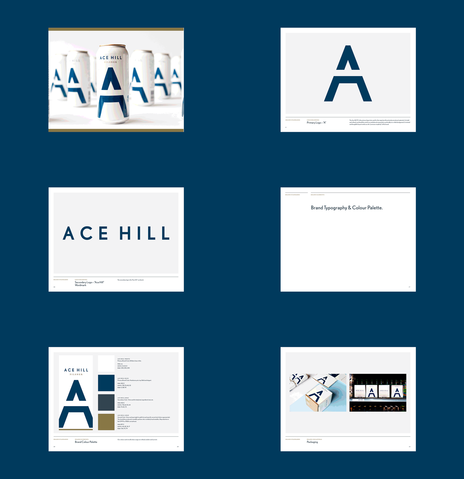


THE LOGO
The “A” is the reduced view of a hill on a landscape. The bold iconic quality of the composition reflects the clean crisp taste of the first brew - the pilsner. The logo is the central element in the Ace Hill visual communications.


