JEMS | RAW DOG REVOLUTIONThe condom aisle is an overwhelming and deeply cringe place.
A dizzying array of brands and features: ribbed, flavoured, fire + ice, magnum, lubed, glow-in-the-dark... All while carcinogenic
ingredients and toxic masculinity persist in perpetuating stigma, shame, misinformation and dis-ease around sex + sexuality.
The condom aisle is an overwhelming and deeply cringe place.
A dizzying array of brands and features: ribbed, flavoured, fire + ice, magnum, lubed, glow-in-the-dark... All while carcinogenic
ingredients and toxic masculinity persist in perpetuating stigma, shame, misinformation and dis-ease around sex + sexuality.
I saw Jems as a condom brand which would embody and reflect the evolving multiplicity of sex and gender expressions of its audience. Geared towards Gen-Z in manner that isn’t merely trendy or pandering but (s)expansive, sensitive, curious and creative. This playful + educational approach builds intimacy and trust bc autonomy & communication are sexiiiii.
SCOPE
Creative Direction
Visual Identity
Photo Direction
Editorial
Custom Type
Packaging Design
Creative Direction
Visual Identity
Photo Direction
Editorial
Custom Type
Packaging Design
COLLABORATORS
Editorial Direction & Vision: Fiona Duncan
AD + Design: Emmi Ojansivu
Social Strategy: Tiffany Wines
Co-Photo Editor: Jessica Canje (Dusc Studios)
Photography: Alessia Gunawan, Deadhungry (Alex Paganelli), Michael Kazimierczuk
Photo Production: Harbinger Creative
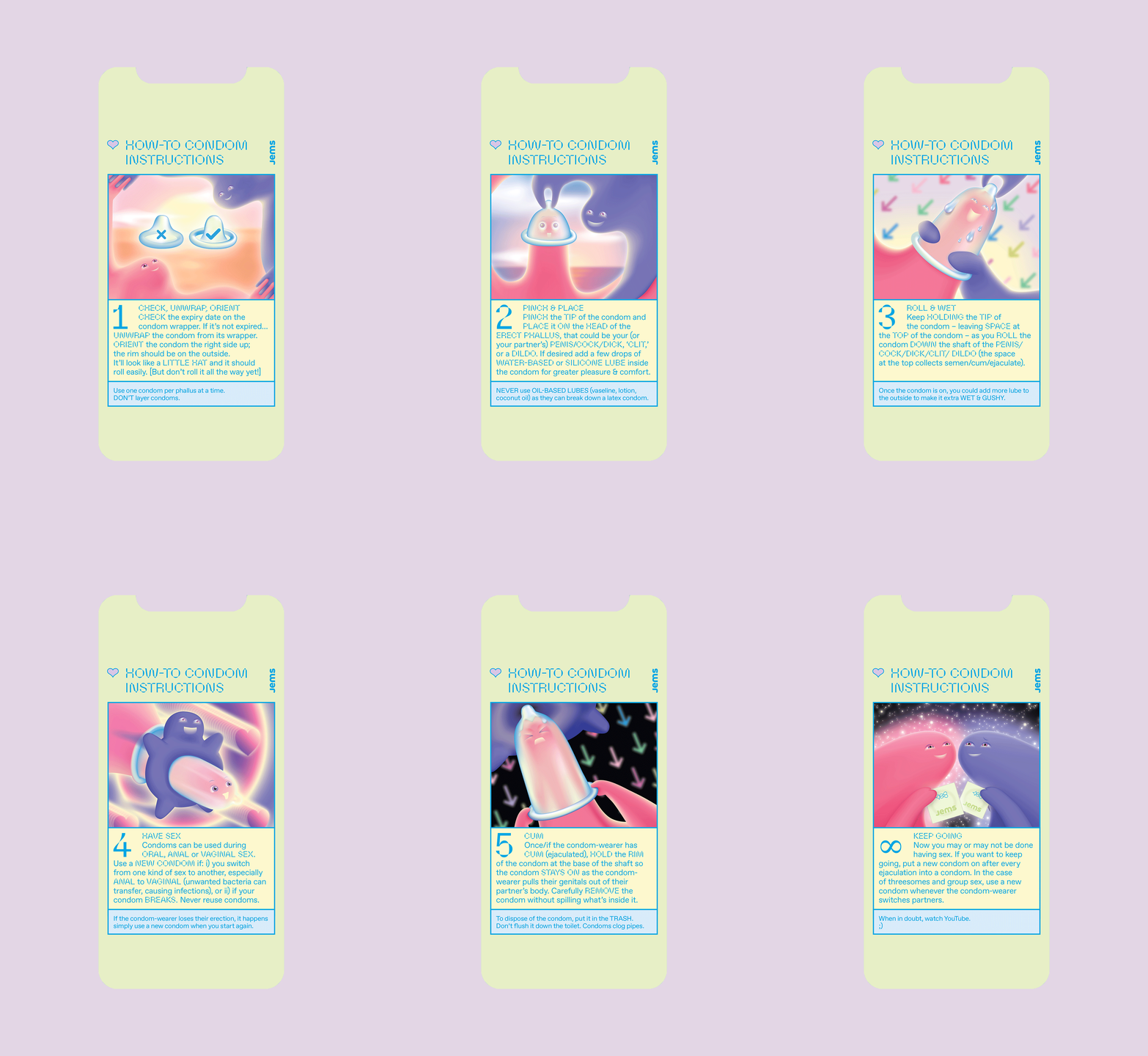
Instructional Condom Art: Michael the III (Michael Rinaldi)


VISUAL IDENTITY + ETHOSThroughout the Jems visual identity there is a feeling of humour + awareness, empathy + intelligence which is the cultivated essence of the brand. I pushed the experimentation of the type + aesthetic to meet the evolving tastes + awareness of the audience, all while remaining true to the core ideological sensibilities of the brand.
Throughout the Jems visual identity there is a feeling of humour + awareness, empathy + intelligence which is the cultivated essence of the brand. I pushed the experimentation of the type + aesthetic to meet the evolving tastes + awareness of the audience, all while remaining true to the core ideological sensibilities of the brand.
Additionally, Jems is founded on the kind of sex-ed that I would have appreciated in high school (+ beyond). One that accesses deeper forms of realness, intimacy + humour to subvert shame and stigma. Through clarity, knowledge and openness we can access a more empowered state. There is a through-line between the logo, photography, colour palette, typography, illustrations and visual + verbal language which embraces the ushy gushy realness of sex. The visuals + ethos have a sensorial, evocative and tactile quality to draw people into the Jems world.


THE LOGOTYPEFor the logo I created a custom wordmark in which the repeated phallic "J" shape is echoed in the “M.” One could say I worked it, flipped it + reversed it.
For the logo I created a custom wordmark in which the repeated phallic "J" shape is echoed in the “M.” One could say I worked it, flipped it + reversed it.
Overall, the design of the package is clear, communicative and quite striking on shelf. The use of the parabole typeface also visually references the pinched “hat” of a condom ;)


EDITORIAL VOICE + VISION
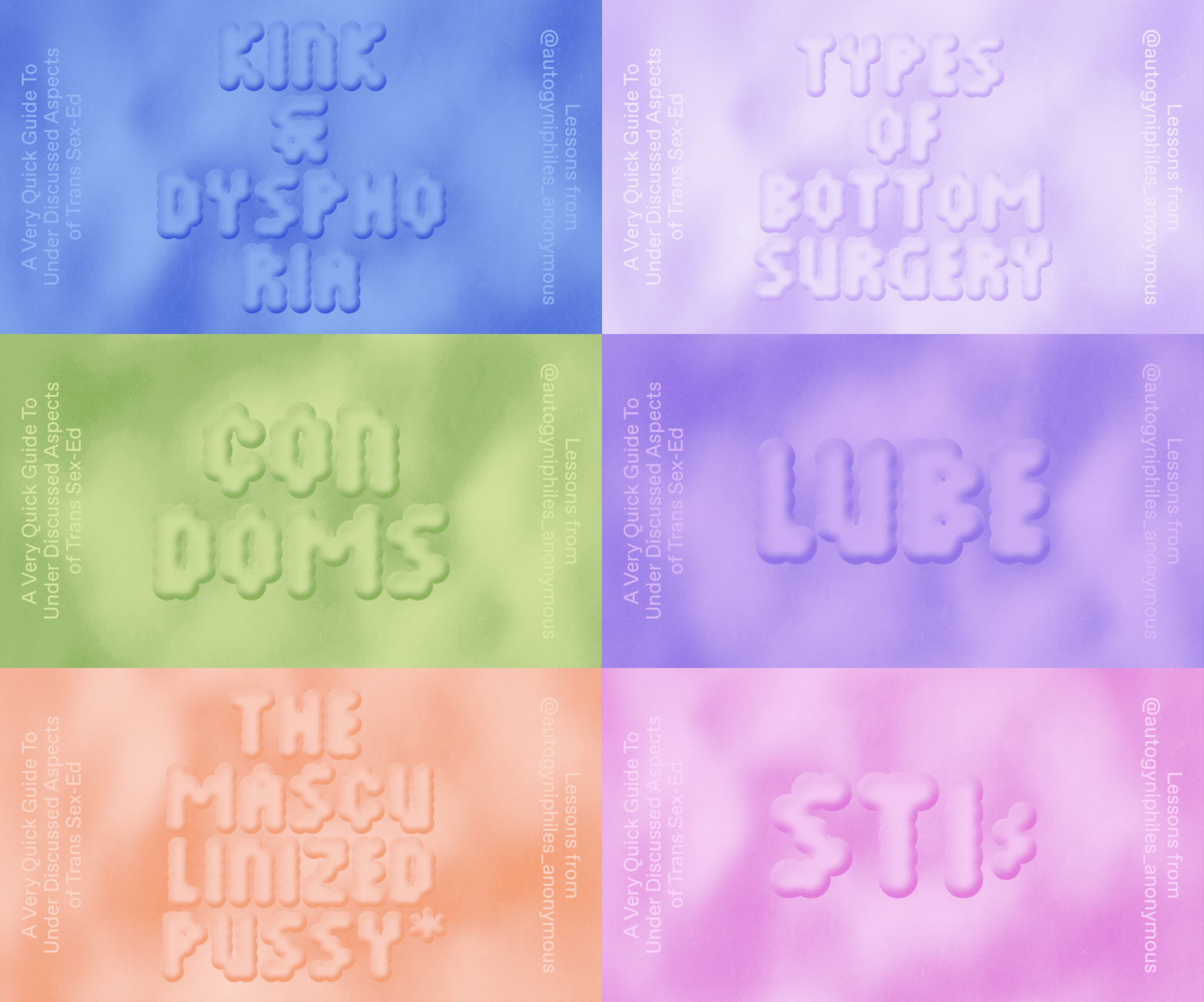
The foundation + felt spirit of the Jems voice and DNA was crafted by the brilliant and highly attuned, Fiona Duncan. It was also essential to cultivate a network of editorial contributors to give Jems a multi-dimensional voice + POV and Fiona wove this together artfully. Enlisting the likes of Autogynphiles Anonymous, Julia Fox, Goddess Earth and many more. Additionally, with sensitivity + awareness, Tiffany Wines built out the digital experience and social strategy.


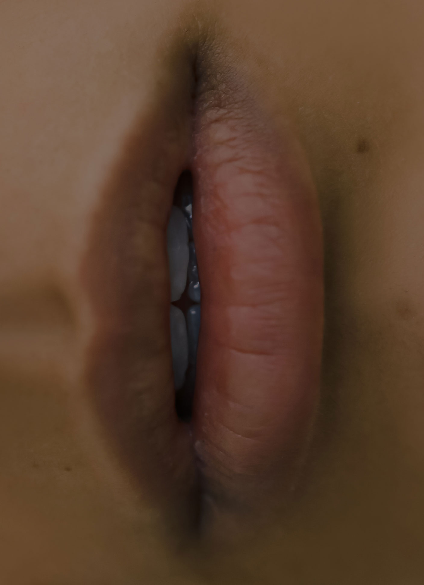
PHOTO DIRECTIONFor the Jems photo direction we cultivated and captured a feeling of vulnerability, awkwardness, sweetness and sincerity.
For the Jems photo direction we cultivated and captured a feeling of vulnerability, awkwardness, sweetness and sincerity.
Alessia Gunawan captured real life couples in Milan during the 2020 lockdown. Seeing subjects with a sense of tenderness and agency. Showing sex and sexuality in a manner that doesn’t feel porny or performative.
Deadhungry lensed overripe bursting fruits with a visceral and sensual tactility.
Michael Kazimierczuk photographed playful blow-ups and sexy wet drips.
Each contributor contributed to the Jems visual language and ethos, infusing the brand with the texture of their own felt experience.

Vulnerable, playful, awkward, sweet & sincere – sex how I wanted to see it.


