CHOICE IN HEALTH CLINIC | REPRODUCTIVE JUSTICEChoice in Health sees deep and unanswered needs when it comes to reproductive justice in our society. Needs for increased access, inclusion, awareness and advocacy.
Choice in Health sees deep and unanswered needs when it comes to reproductive justice in our society. Needs for increased access, inclusion, awareness and advocacy.
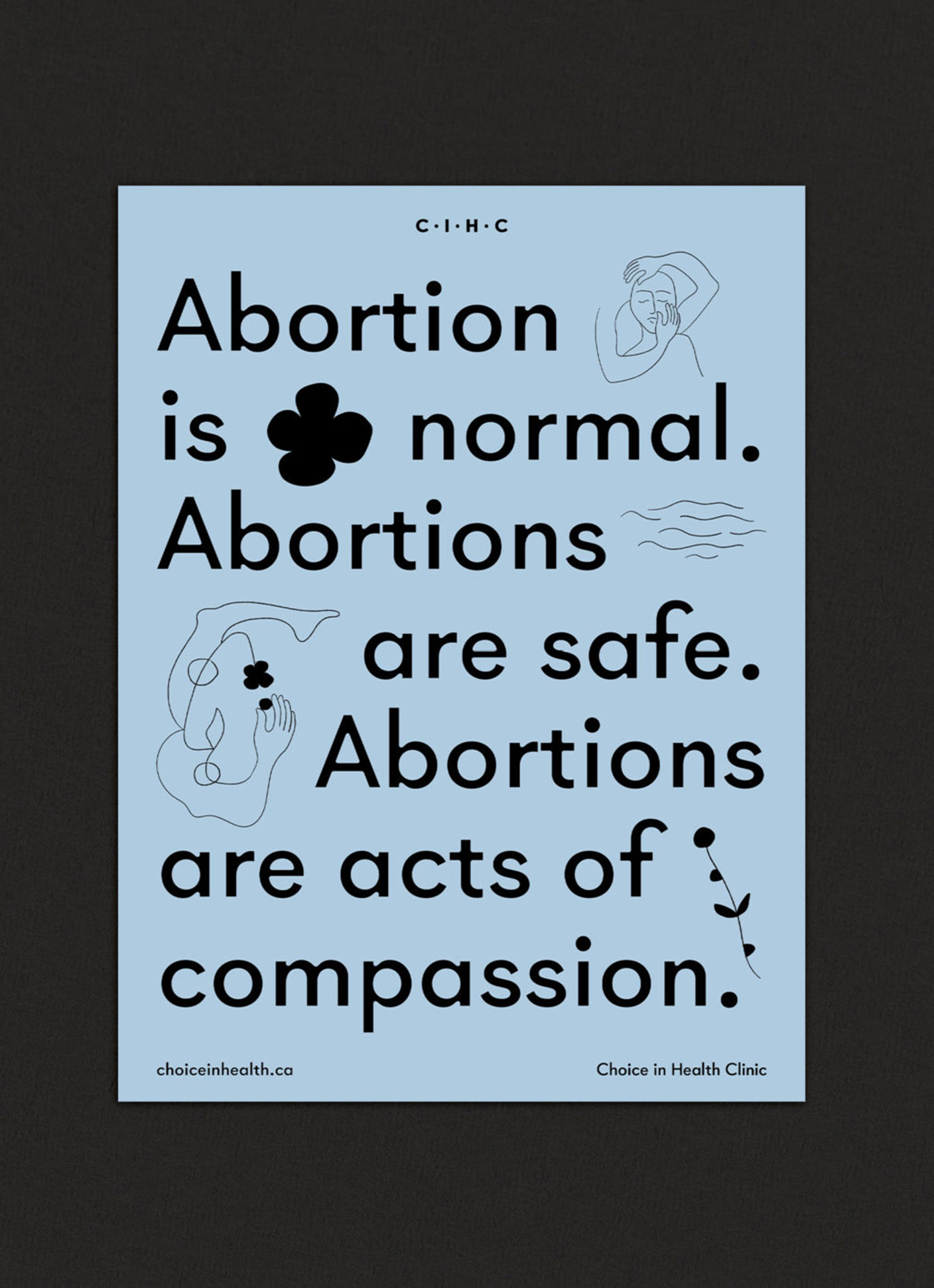
Driven by the desire to remove shame, Choice in Health recognizes that abortion is not merely permissible under the law, but an essential, important, positive and powerful.
Choice in Health focuses on each individual who accesses their services; their personal experience and needs. But the ripple outwards, the impact of those actions, carries weight. Choice in Health continues to push into new frontiers; changing and adapting to new political climates and responding directly to the people they serve. The pregnant people facing a whole host of invisible barriers – and fight to identify and remove them.
Being informed is being empowered. Knowledge supports agency. Agency supports access. Choice in Health can be –and needs to be – a voice for a movement positioning abortion care as essential healthcare.
SCOPE
Creative Direction
Visual Identity
Creative Direction
Visual Identity
COLLABORATORS
Design + Illustrations: Emmi Ojansivu
Strategy: Casey Hinton
Design + Illustrations: Emmi Ojansivu
Strategy: Casey Hinton


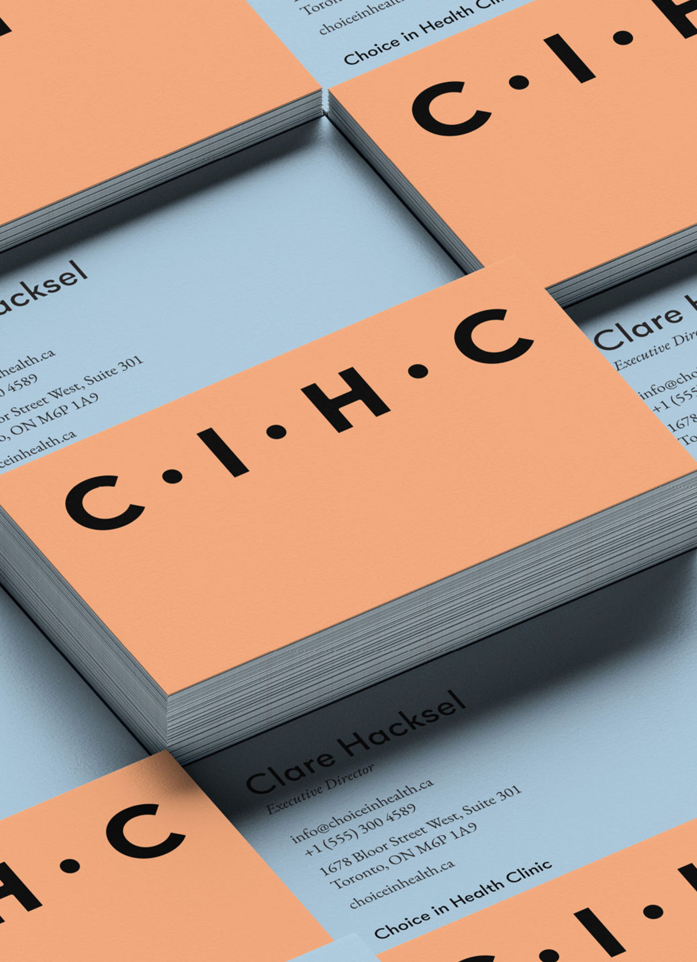
VISUAL IDENTITY + ETHOS CIHC’s tone is approachable, open and compassionate – always meeting people where they are. Illustrating that they’re both healthcare and self-care experts. Their communications are clear and straightforward, imbued with warmth and humanity.
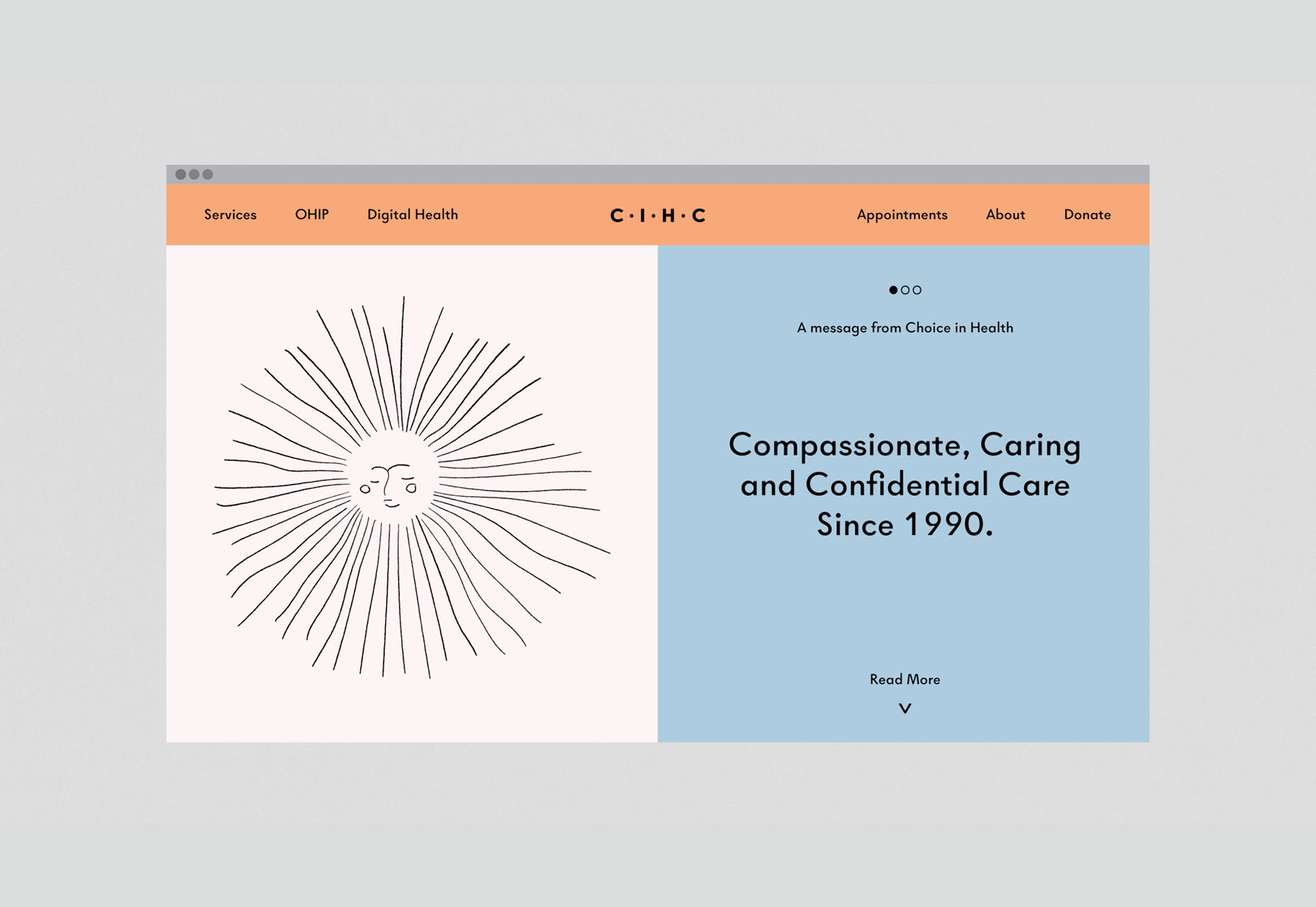
Working with Choice in Health Clinic was a beautiful and profound experience. They are an abortion clinic located in downtown Toronto providing their services and advocacy work for decades. This was the opportunity to learn how to best support their work and evolving needs in the changes to care and services in the “post-covid” landscape and the current political landscape. Developing a brand system which speaks to the multi-dimensional care they provide –emotionally, mentally, financially, physically and more.
As such, we saw the need to infuse the brand with a human touch and rendered illustrations that spoke to the mark of the hand. Communicating the distinct personality of CIHC - one that is a voice and an advocate in the community, one that positions abortion as care, one that holds space for agency and seeks to dismantle oppression to actively include.
CIHC’s tone is approachable, open and compassionate – always meeting people where they are. Illustrating that they’re both healthcare and self-care experts. Their communications are clear and straightforward, imbued with warmth and humanity.


TYPEFACES + ILLUSTRATIONS
The selected typefaces have an inky, bold and lived-in quality. Whilst the brand illustrations embody care, calm and comfort. They are inclusive - hinting at human forms, whilst not gendered. All assets are designed to be easily print-ready so they can be produced and shared with ease.


