JEMS | RAW DOG REVOLUTIONThe condom aisle is an overwhelming and deeply cringe place.
A dizzying array of brands and features: ribbed, flavoured, fire + ice, magnum, lubed, glow-in-the-dark... All while carcinogenic
ingredients and toxic masculinity persist in perpetuating stigma, shame, misinformation and dis-ease around sex + sexuality.
The condom aisle is an overwhelming and deeply cringe place.
A dizzying array of brands and features: ribbed, flavoured, fire + ice, magnum, lubed, glow-in-the-dark... All while carcinogenic
ingredients and toxic masculinity persist in perpetuating stigma, shame, misinformation and dis-ease around sex + sexuality.
I saw Jems as a condom brand which would embody and reflect the evolving multiplicity of sex and gender expressions of its audience. Geared towards Gen-Z in manner that isn’t merely trendy or pandering but (s)expansive, sensitive, curious and creative. This playful + educational approach builds intimacy and trust bc autonomy & communication are sexiiiii.
SCOPE
Creative Direction
Visual Identity
Photo Direction
Editorial
Custom Type
Packaging Design
Creative Direction
Visual Identity
Photo Direction
Editorial
Custom Type
Packaging Design
COLLABORATORS
Editorial Direction & Vision: Fiona Duncan
AD + Design: Emmi Ojansivu
Social Strategy: Tiffany Wines
Co-Photo Editor: Jessica Canje (Dusc Studios)
Photography: Alessia Gunawan, Deadhungry (Alex Paganelli), Michael Kazimierczuk
Photo Production: Harbinger Creative
Instructional Condom Art: Michael the III (Michael Rinaldi)


VISUAL IDENTITY + ETHOSThroughout the Jems visual identity there is a feeling of humour + awareness, empathy + intelligence which is the cultivated essence of the brand. I pushed the experimentation of the type + aesthetic to meet the evolving tastes + awareness of the audience, all while remaining true to the core ideological sensibilities of the brand.
Throughout the Jems visual identity there is a feeling of humour + awareness, empathy + intelligence which is the cultivated essence of the brand. I pushed the experimentation of the type + aesthetic to meet the evolving tastes + awareness of the audience, all while remaining true to the core ideological sensibilities of the brand.
Additionally, Jems is founded on the kind of sex-ed that I would have appreciated in high school (+ beyond). One that accesses deeper forms of realness, intimacy + humour to subvert shame and stigma. Through clarity, knowledge and openness we can access a more empowered state. There is a through-line between the logo, photography, colour palette, typography, illustrations and visual + verbal language which embraces the ushy gushy realness of sex. The visuals + ethos have a sensorial, evocative and tactile quality to draw people into the Jems world.


THE LOGOTYPEFor the logo I created a custom wordmark in which the repeated phallic "J" shape is echoed in the “M.” One could say I worked it, flipped it + reversed it.
For the logo I created a custom wordmark in which the repeated phallic "J" shape is echoed in the “M.” One could say I worked it, flipped it + reversed it.
Overall, the design of the package is clear, communicative and quite striking on shelf. The use of the parabole typeface also visually references the pinched “hat” of a condom ;)


EDITORIAL VOICE + VISION
The foundation + felt spirit of the Jems voice and DNA was crafted by the brilliant and highly attuned, Fiona Duncan. It was also essential to cultivate a network of editorial contributors to give Jems a multi-dimensional voice + POV and Fiona wove this together artfully. Enlisting the likes of Autogynphiles Anonymous, Julia Fox, Goddess Earth and many more. Additionally, with sensitivity + awareness, Tiffany Wines built out the digital experience and social strategy.


PHOTO DIRECTIONFor the Jems photo direction we cultivated and captured a feeling of vulnerability, awkwardness, sweetness and sincerity.
For the Jems photo direction we cultivated and captured a feeling of vulnerability, awkwardness, sweetness and sincerity.
Alessia Gunawan captured real life couples in Milan during the 2020 lockdown. Seeing subjects with a sense of tenderness and agency. Showing sex and sexuality in a manner that doesn’t feel porny or performative.
Deadhungry lensed overripe bursting fruits with a visceral and sensual tactility.
Michael Kazimierczuk photographed playful blow-ups and sexy wet drips.
Each contributor contributed to the Jems visual language and ethos, infusing the brand with the texture of their own felt experience.

Vulnerable, playful, awkward, sweet & sincere – sex how I wanted to see it.


<3


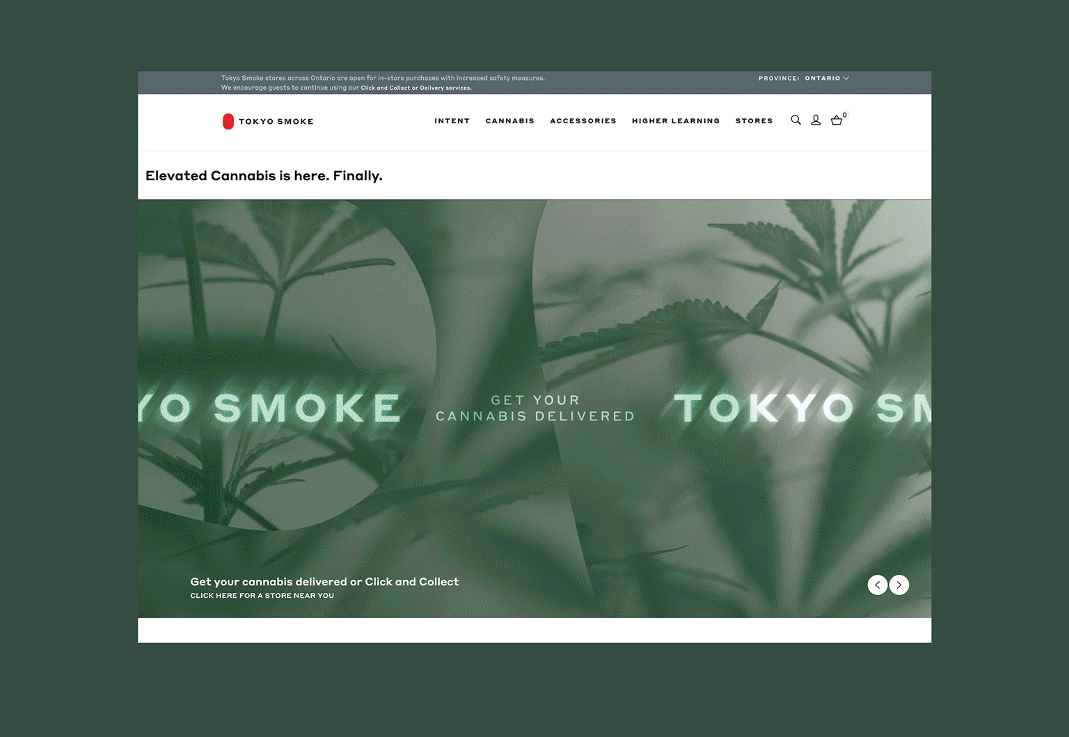
TOKYO SMOKE | HIGH DESIGN Yearsss before legalization, I saw a raw opportunity in Tokyo Smoke. To not only create a brand, but to influence and shape an industry at large. Cannabis has a deep history of fear-based stereotypes which have fuelled intense psychological and physical risk for many. But in these deeply entrenched stigmas I saw great creative possibilities and potentials that intrigued me.
Yearsss before legalization, I saw a raw opportunity in Tokyo Smoke. To not only create a brand, but to influence and shape an industry at large. Cannabis has a deep history of fear-based stereotypes which have fuelled intense psychological and physical risk for many. But in these deeply entrenched stigmas I saw great creative possibilities and potentials that intrigued me.
SCOPE
Creative Direction
Design
Brand Strategy
Photo + Video Direction
Campaigns
Visual Identity
Store + Product Direction
Campaign Creation
Experiential
Packaging
Web
Design
Brand Strategy
Photo + Video Direction
Campaigns
Visual Identity
Store + Product Direction
Campaign Creation
Experiential
Packaging
Web
COLLABORATORS
ACD: Brett Ramsay
Design Team: Andrew Cooper, Egor Sokolov
3D Illustration + Motion: Andrew Cooper
Writing: Maggie Buxton-Simpson
Photography: Mark Olson, Bryan Hyunh, Nik Mirus, Jodie + Alex, Nathan LangArtists: Six N. Five, Karen Singh, Antti Kalevi, Dahae Song
Creative Product Collaborations: Holt Renfrew, Concrete Cat, High Noon, Sundae School, Castor, Simple Society


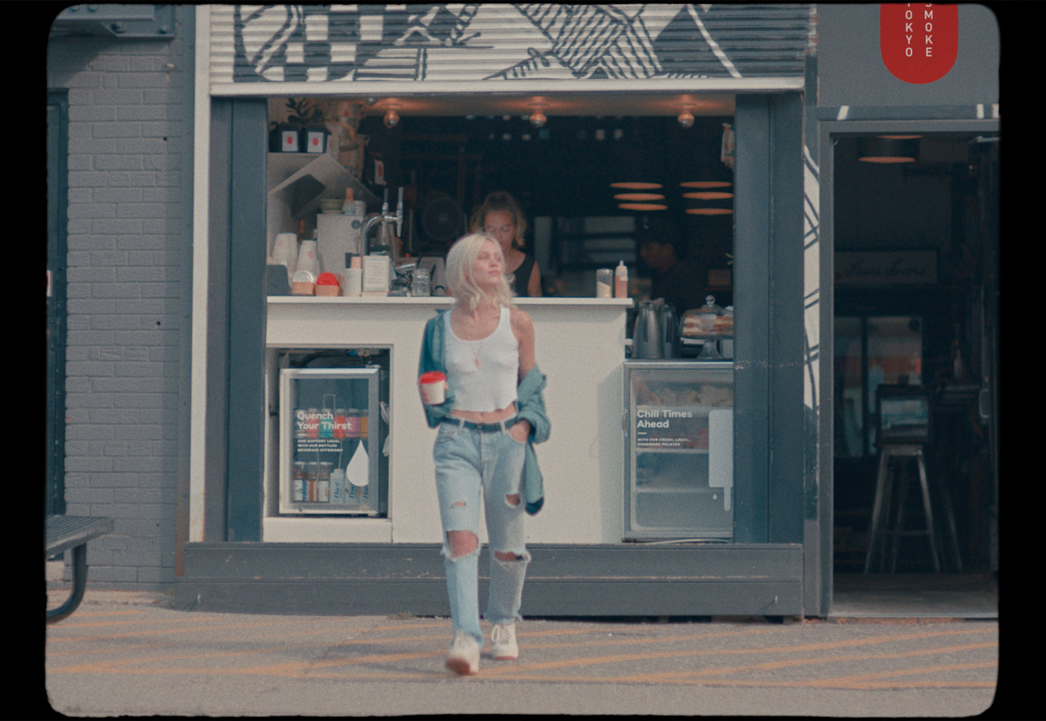
VISUAL IDENTITY + ETHOSAt the genesis of the Tokyo Smoke brand, there was no precedent for cannabis branding, and to enjoy cannabis was to be labelled a stoner. However, in my experience and observations it was not an identity - but rather - a ritual and experience. I also saw that things like alcohol + pharmaceuticals, took you more outside of yourself – encouraging numbing and disassociation – while weed often made me more introspective, creative + aware.
At the genesis of the Tokyo Smoke brand, there was no precedent for cannabis branding, and to enjoy cannabis was to be labelled a stoner. However, in my experience and observations it was not an identity - but rather - a ritual and experience. I also saw that things like alcohol + pharmaceuticals, took you more outside of yourself – encouraging numbing and disassociation – while weed often made me more introspective, creative + aware.
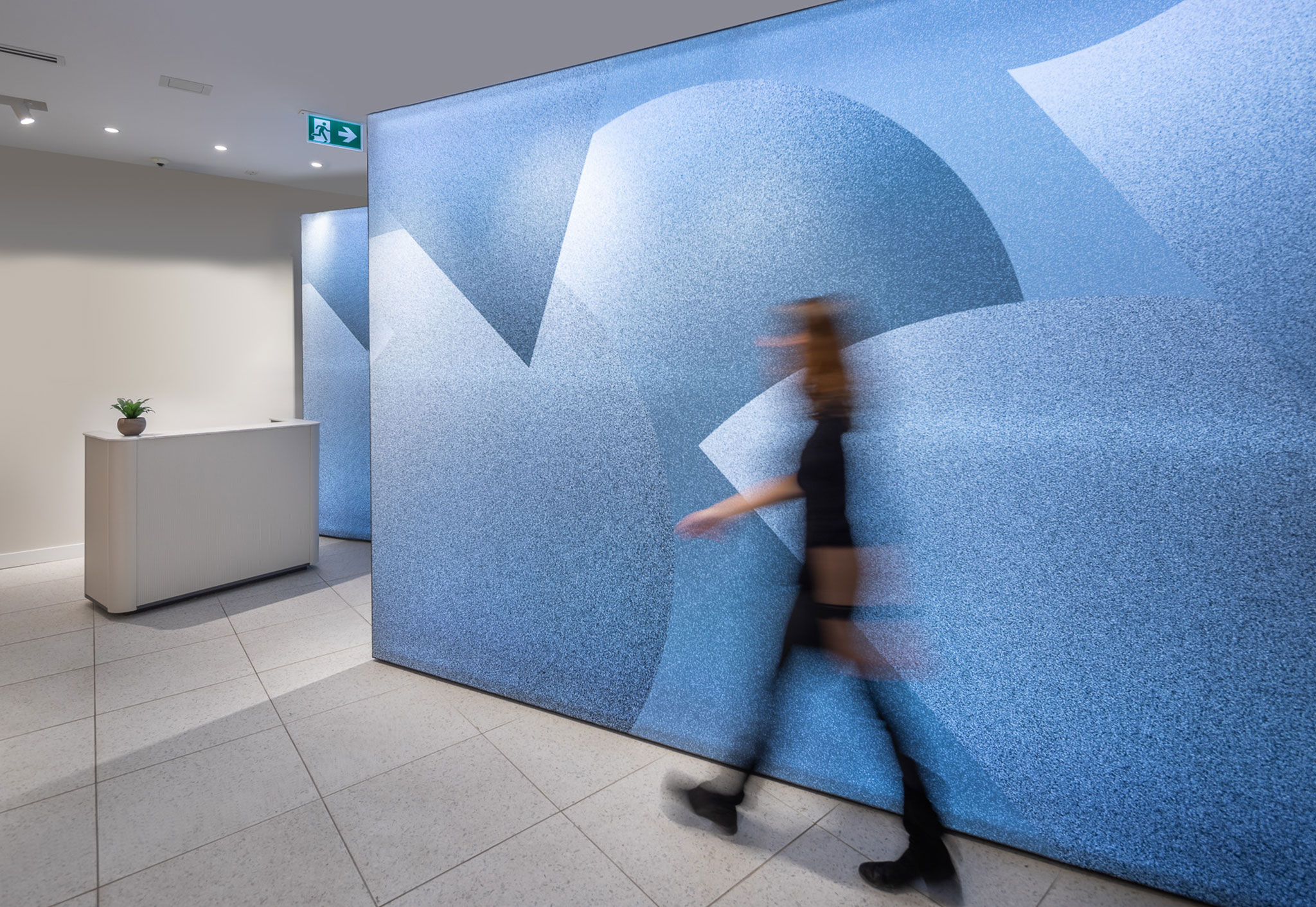
In the creation of the Tokyo Smoke brand, I saw worlds unfolding that spoke to a holistic approach to the entirety of the experience. New visual languages and understandings around set + setting. Showing the spectrum of the experience and softening people’s relationship with the plant. Thoughtfully infusing education and creativity into the Tokyo Smoke brand DNA – in the design of the cafés, stores, tools, products, campaigns, experiential, digital experiences, print collateral and more. Education also felt like a critical pillar on which to build the brand in order to resource and empower people to make the best choices for their experiences and bodies. Then through multi-sensorial experiences and high design, create a vibey experience of intentionality. A portal.

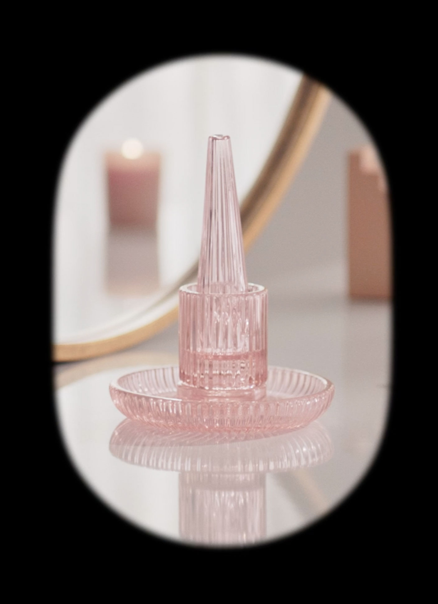
 The Tokyo Smoke Rolling Tray & Pipe designed by Castor


The Heirloom Stack designed by Castor
PRODUCT + RETAIL
Apple bongs, gravity bongs, head shops – while I appreciate the resourcefulness, the vibe did not resonate. Looking at set + setting, highlighting the preparation and ceremony, I saw the design of the Tokyo Smoke product and retail spaces as ways to make cannabis more inviting and intentional. Instead of shamefully stashing away grungey bongs + roaches, pieces like the Heirloom Stack are artful conversation pieces – evocative of your grandmother’s candy dish. Through greater functionality and cleanliness and working alongside visionary collaborators, we elevated a routine into a ritual. Collaborators included: Castor, Sundae School, Holt Renfrew, Laundry Day, Jackman Reinvents, Concrete Cat and more.


The Whole Flower campaign created in collaboration with CATK | Sound by Apollo Studios TO


To see more of the Tokyo Smoke video campaigns, click here


To see more of the Tokyo Smoke Terpene Worlds, click here

TERPENE WORLDS | TURN ON, TUNE IN
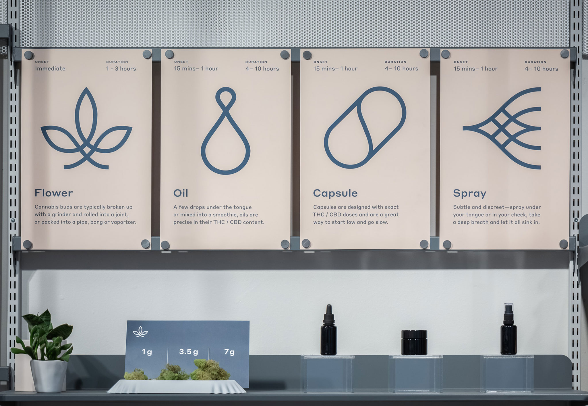
For every other cannabis brand, the approach to visualizing terpenes is the same. Antiqued 1800s-esque botanical drawings and a written description of the terpene properties. Terpenes are the naturally occurring chemical compounds found in plants and they’re responsible for the aromas, flavours, and even colors associated with various types of vegetation. In terms of cannabis, terpenes are what make certain strains smell or taste different from others and they can work in synergy with cannabinoids and cannabis plant compounds to produce enhance the psychoactive effects. As such, these visuals incite a visceral reaction to indicate the smells, flavours, textures and experience that each profile elicits. Immersing the viewer in a multi-sensorial world.
SCOPE
Visual + Audio Direction
Visual + Audio Direction
COLLABORATORS
Tokyo Smoke Design Team
Tokyo Smoke Design Team
CONCEPT
Each terpene world draws out a synesthesic response. Abstract landscapes with integrated representational elements speak to the spectrum of experiences you can have with terpenes and cannabis varietals.
Each terpene world draws out a synesthesic response. Abstract landscapes with integrated representational elements speak to the spectrum of experiences you can have with terpenes and cannabis varietals.
Ethereal lavender and mint bushes flow through the valleys of a chill + placid lake (the purple-toned video above) illustrating the calming, balancing and inflammation-reducing effects of Linalool.
The refreshing, vital and bronchodilating nature of Pinene (shown below) is seen in the undulating hills.
The pain and stress relief that comes from Myrcene (also commonly found in thyme and lemongrass) induces a cozy and lush feeling.
You can feel the citrusy-freshness, invigorating and mood-boosting properties of Limonene.
Caryophyllene boosts CBD effects and brings about pain and anxiety relief with a relieving and comforting quality.


TOKYO SMOKE CAMPAIGNS | PART OF YOUR WORLD
Creating the Tokyo Smoke campaigns was a FEAT amidst the intense Federal legal regulations in cannabis marketing and advertising. There was so much that you couldn’t say, do or show. You couldn’t show people consuming, couldn’t speak to the benefits of cannabis, couldn’t show animals, nothing could appear too “lifestyle” or “glam” (which was largely open to interpretation) – it was a very complex rubiks cube. Having seemingly insurmountable limitations became the ultimate creative challenge.
SCOPE
Creative Direction
Design
Brand Strategy
Photo + Video Direction
Campaigns
Visual Identity
Store + Product
Campaigns
Experiential
Packaging
Web Design
Design
Brand Strategy
Photo + Video Direction
Campaigns
Visual Identity
Store + Product
Campaigns
Experiential
Packaging
Web Design
COLLABORATORSACD: Brett Ramsay
Design Team: Andrew Cooper, Egor Sokolov
3D Illustration + Motion: Andrew Cooper
Writing: Maggie Buxton-Simpson
Photography: Mark Olson, Bryan Hyunh, Nik Mirus, Jodi Heartz + Alex Blouin, Nathan LangArtists: Six N. Five, Karen Singh, Antti Kalevi, Dahae Song
Creative Product Collaborations: Holt Renfrew, Concrete Cat, High Noon, Sundae School, Castor, Simple Society

CONCEPT + ETHOS
Having so many rigid limitations just meant I wanted to be as cheeky as possible. And if there was so much we couldn’t make claims to or say explicitly, I spoke to the experience of consuming cannabis. World-building to illustrate the spectrum of experience one could have. That it wasn’t purely about getting ripped or zooted. It could be elegant + light like the Heirloom Stack pipe. It could be contemplative + introspective like the burn kit. Or playful + creative like the Calla Roll tool. Anthropomorphizing products in this way opened up the capacity to demystify cannabis + help people see it differently.

HIGH CLASSIn writing, concepting and directing this 4-part product video series, I looked to educational videos from the 1950s. However, instead of epousing techniques on better hygiene or social etiquette, these teach the audience how to more effectively roll a joint, curate your ‘stash’ and set-up an intentional experience. With a witty and irrerevant tone these videos make education, fun :)
In writing, concepting and directing this 4-part product video series, I looked to educational videos from the 1950s. However, instead of epousing techniques on better hygiene or social etiquette, these teach the audience how to more effectively roll a joint, curate your ‘stash’ and set-up an intentional experience. With a witty and irrerevant tone these videos make education, fun :)
The 30-second spots played in cineplex theatres before films, while the 10 + 15-second cut-downs were utilized as digital ads.
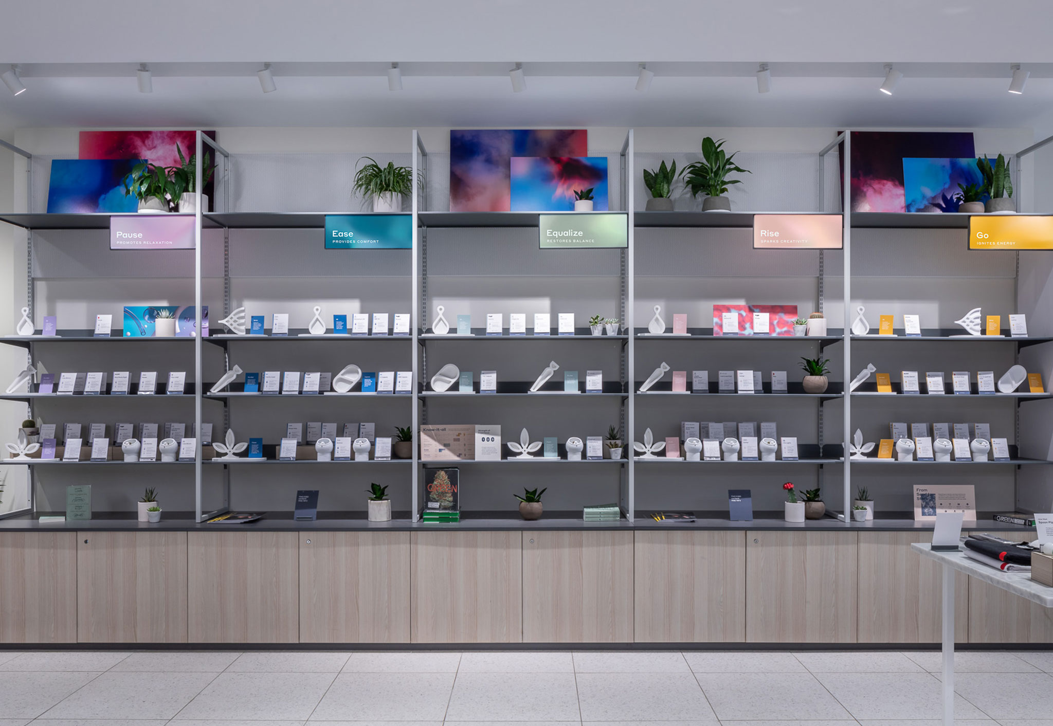
WHOLE FLOWER INTENTSIn this campaign we showcased the Tokyo Smoke cannabis and each ‘Intent’ varietal. The general public’s knowledge + understanding on THC vs. CBD, different strains and their effects make understanding + purchasing cannabis - overwhelimg. This spot spoke to the different experiences of each strain - visually + vibrationally - through our ‘Intent’ system. Similarly all of the Tokyo Smoke cannabis in the retail environment was categorized based on ‘Intent’ to streamline the complex nunances of cannabis strains in an intutive and meanginful way. Digital Art/Animation by CATK.
In this campaign we showcased the Tokyo Smoke cannabis and each ‘Intent’ varietal. The general public’s knowledge + understanding on THC vs. CBD, different strains and their effects make understanding + purchasing cannabis - overwhelimg. This spot spoke to the different experiences of each strain - visually + vibrationally - through our ‘Intent’ system. Similarly all of the Tokyo Smoke cannabis in the retail environment was categorized based on ‘Intent’ to streamline the complex nunances of cannabis strains in an intutive and meanginful way. Digital Art/Animation by CATK.

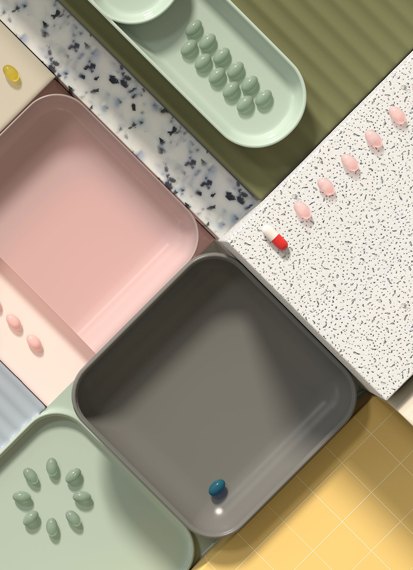
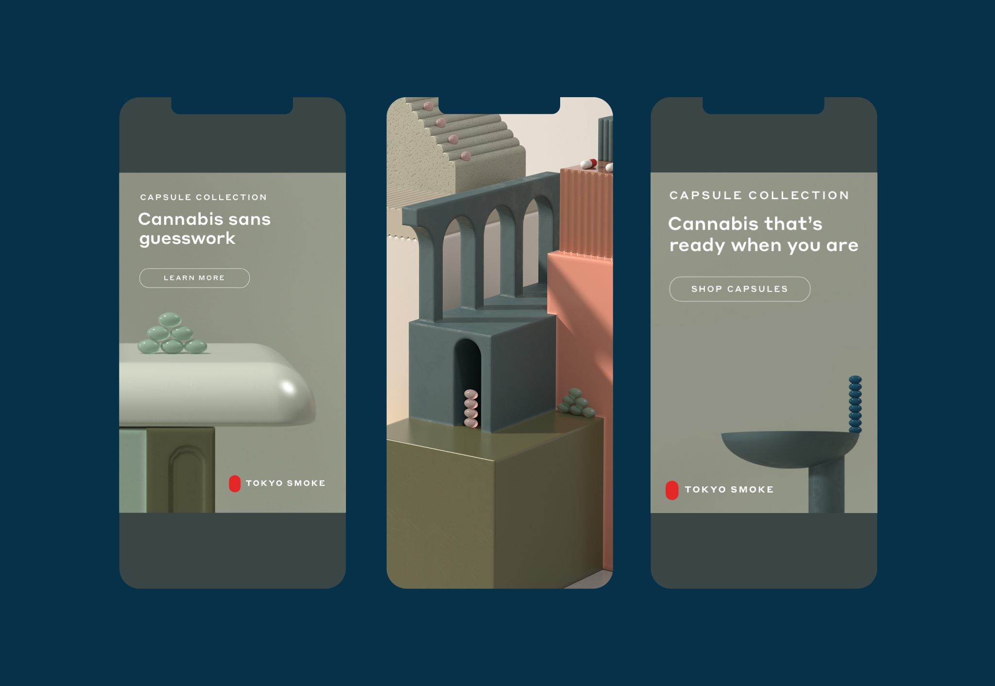
CAPSULE COLLECTION
Capsules are stunningly functional, small, discreet, easy-to-transport and
smokeless – making them a highly effective form of cannabis consumption. However, many don’t yet know or appreciate the effacacy, convenience or experience a
capsule can bring. This campaign sought to inform + inspire the viewer. For the creative we were inspired by the Ulm School and vintage pharmacist trays - seeing beauty in clean,
organized and functional design. Lastly, the artful and intentional display of capsules communicates the benefits of buildable dosages. Digital Art/Animation by Six N. Five.

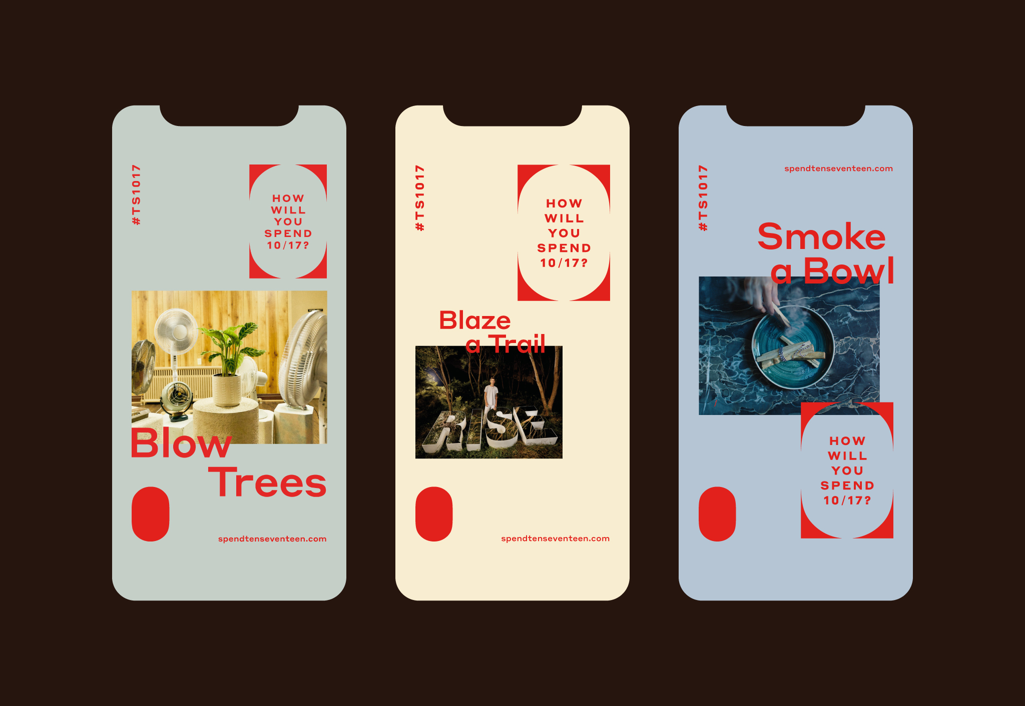
HOW WILL YOU SPEND 10/17?
A momentous event in Canadian history – the day of weed legalization !!! – October 17th, 2018. Also in typical Canadian fashion this cannabis campaign could not (legally) make any overt mention of cannabis or cannabis use. A real conundrum! As such the tagline “how will you spend 10/17” pays homage to this day, and all activities mentioned are a cheeky reference to sweet mary jane. E.g. How will you spend 10/17? Up High, Down Low, On the Go, Feel the Breeze, Blow Trees, Smoke a Bowl, Spark One, etc. :)
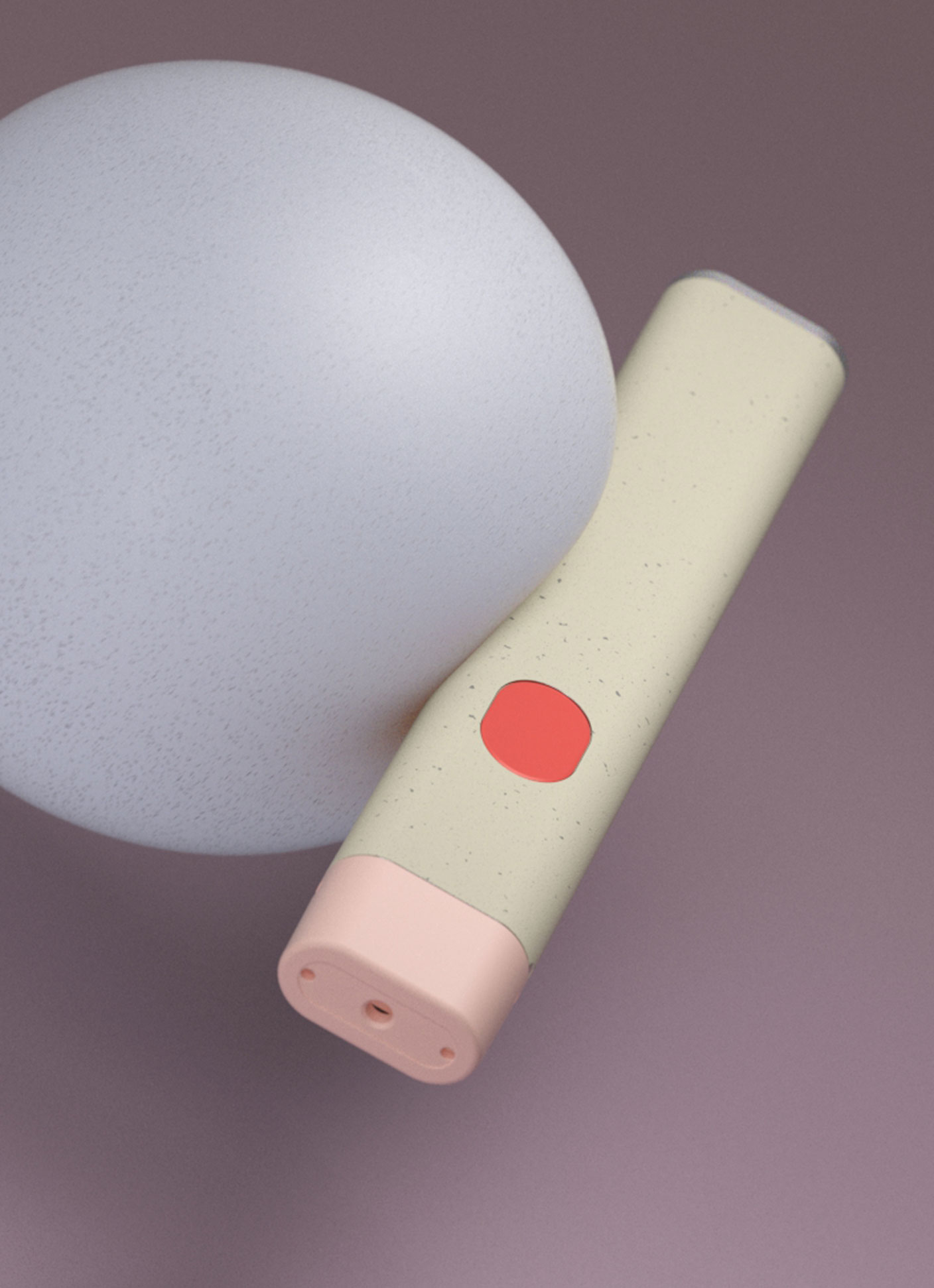
LUMA
The Tokyo Smoke Luma – a portable, easy-to-use cannabis
vape. With a product family of five intent pods – each with distinctive extracts – has simplified how to enjoy cannabis. Cannabis vapes can often feel sterile and overly
techy, leaving a need for something that
humanizes the experience.
The Tokyo Smoke Luma – a portable, easy-to-use cannabis
vape. With a product family of five intent pods – each with distinctive extracts – has simplified how to enjoy cannabis. Cannabis vapes can often feel sterile and overly
techy, leaving a need for something that
humanizes the experience.
The addictively-tactile design of the Luma
indulges an emotional desire we never knew
we had. With visuals so satisfying, we feel
what we see. Digital Art/Animation by CATK.
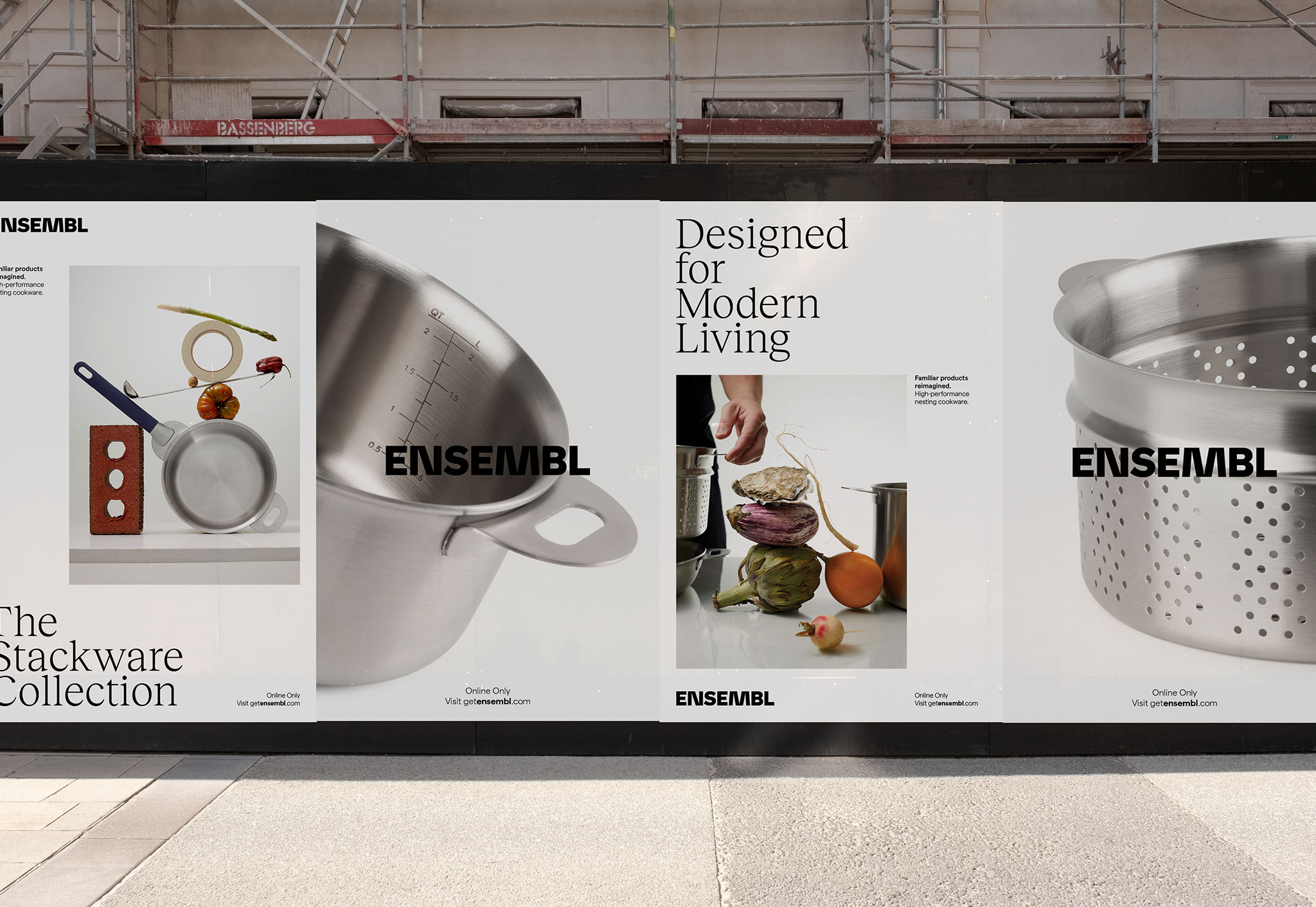
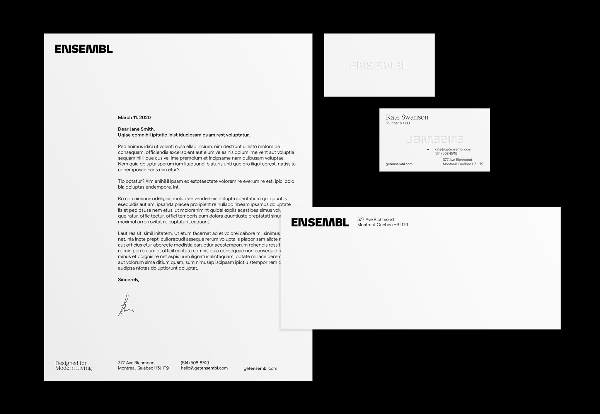
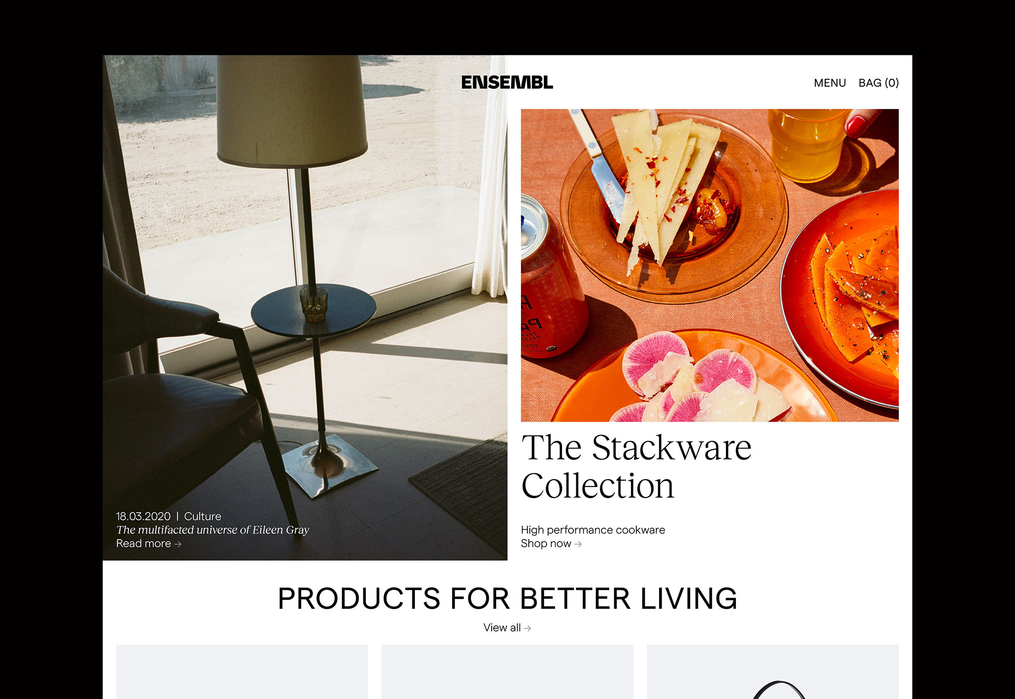
ENSEMBL | NESTING INSTINCTS
Born in a small kitchen, Ensembl is inspired by a big idea: The things we own should serve us well. They should fit into our lives and enhance our experiences. With its debut collection of high-performance highly-stackable kitchenware, Ensembl has set the tone for its future, reimagining familiar products for modern life.
SCOPE
Creative Direction
Visual Identity
Photo Direction
Creative Direction
Visual Identity
Photo Direction
COLLABORATORS
Design: Laura Soper
Strategy: Casey Hinton
Photography: Nathan Lang
Still Life Styling: Zacharie Lavertu
Production: Rodeo Production
Design: Laura Soper
Strategy: Casey Hinton
Photography: Nathan Lang
Still Life Styling: Zacharie Lavertu
Production: Rodeo Production


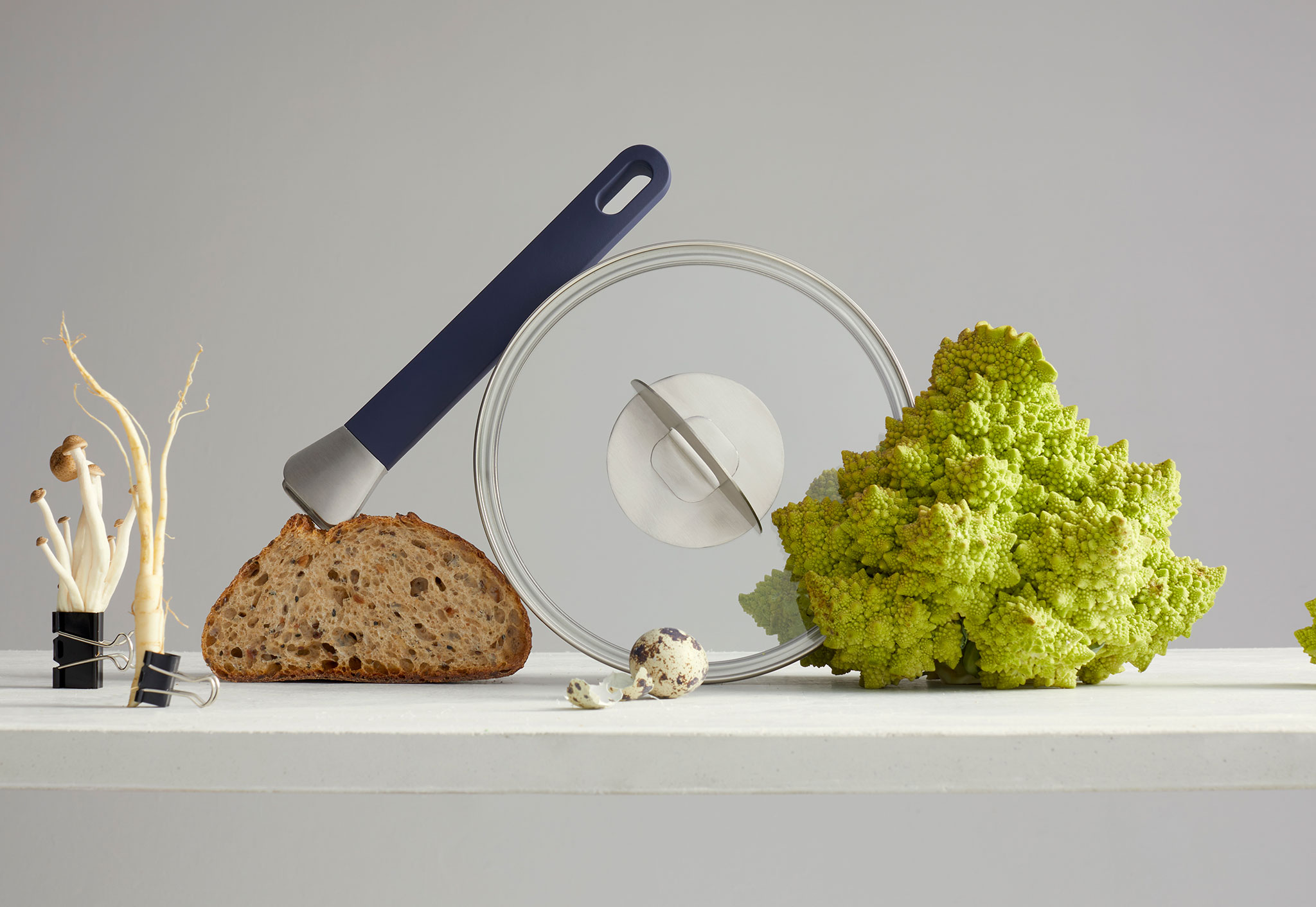
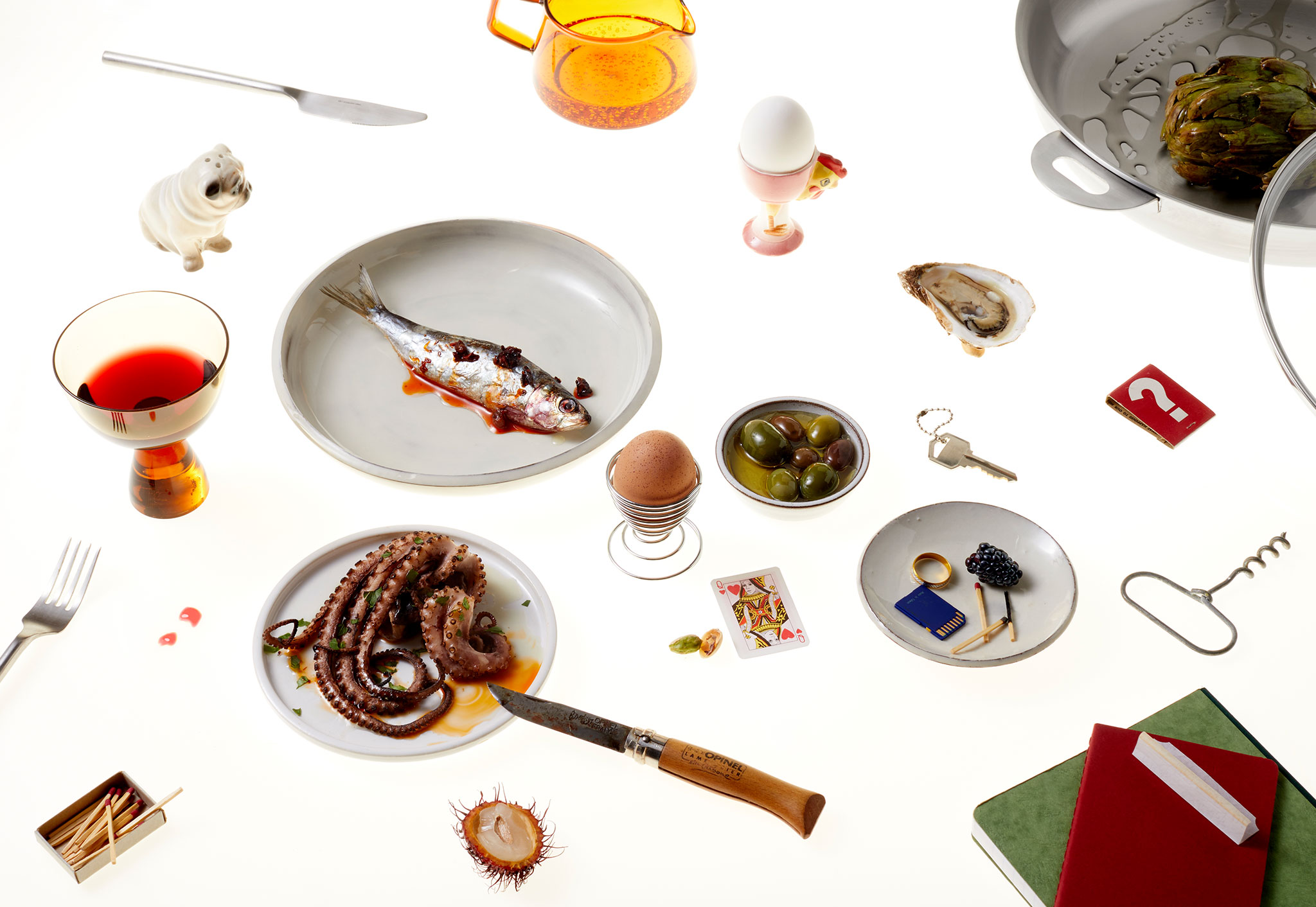
BRAND ETHOSFor the visual identity and photo direction I saw Ensembl as truly distinctive from their traditional, stodgey and elitist cookware competitiors. This is cookware for the true at-home chef. One who enjoys the creativity of the process, who loves gathering + entertaining. One who embraces the beauty, messiness and joy of cooking. As such, we see the cookware mixed in with elements of everyday life - ingredients, housekeys, children’s toys, smears of oil + sauce, etc.
For the visual identity and photo direction I saw Ensembl as truly distinctive from their traditional, stodgey and elitist cookware competitiors. This is cookware for the true at-home chef. One who enjoys the creativity of the process, who loves gathering + entertaining. One who embraces the beauty, messiness and joy of cooking. As such, we see the cookware mixed in with elements of everyday life - ingredients, housekeys, children’s toys, smears of oil + sauce, etc.
There is a visceral quality - with food textures and shapes - their visual tactility communicated through the imagery. This is food deconstructed, reassembled + rethought. Presenting food + recipes anew – further illustrating that Ensembl has rethought + innovated cookware, cooking and our relationship to food.
As Ensembl evolves, it will continue to build a reputation for original, imaginative and enduring design, and a unique capacity to improve everyday life.